
Rob brings over twenty-five years of experience with application development and systems architecture fused with an insatiable thirst for technology as a technical program manager.
Updated Mar 23, 2023
 Fullstack D3 and Data Visualization
While starting my initial exploration of data visualization, I found a book titled Fullstack D3 and Data Visualization that covers example use cases and invites readers to question the possibilities inherent to D3 and data visualization.
Written by a front-end developer and designer with a background in research, the book doesn’t just show you a bunch of code and stop there. Each bite-sized lesson explains why you would want to perform certain actions and make certain kinds of enhancements. In one of the early chapters on accessibility navigation through bar graphs, instead of letting the reader just tap on a page to see an obvious declaration like, “Hey, you’re on a bar,” you are instead guided on how to customize to deliver helpful specifics about that bar such as, “There were 36 people between 5’ 3” and 5’ 4” in your height sample group.”
I’ve always been interested in the possibilities of D3, but up until Fullstack D3 and Data Visualization, my investigation fell into obligatory beginning aspects (like line graphs). Yet with this book, I was able to climb higher into a more interesting territory and want to share some of that gained wisdom with you.
Line Charts, Scatterplots, and Histogram ChartsThe book’s first three chapters help you get accustomed to D3 and guide you through illustrating your data so that it offers at-a-glance insights. While it gives you an example dataset, the book is also kind enough to provide a Python script so you can grab your data.
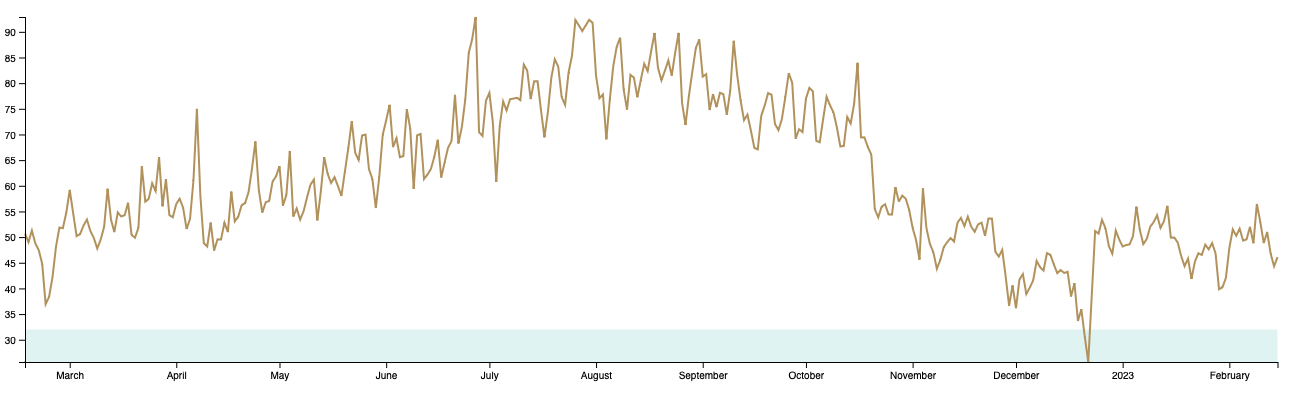
Here, we’re looking at a line graph of weather data I found from the Saturn building in the Fremont neighborhood of Seattle (also home to GenUI’s headquarters).
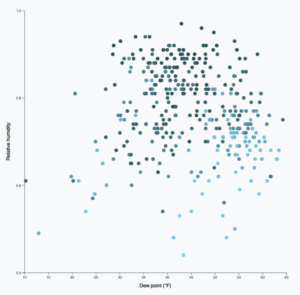
With D3, you can take this data and build a scatterplot that compares different dew points and relative humidity, as well as uses coloring to indicate whether or not cloud coverage was high on a given day.
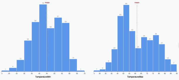
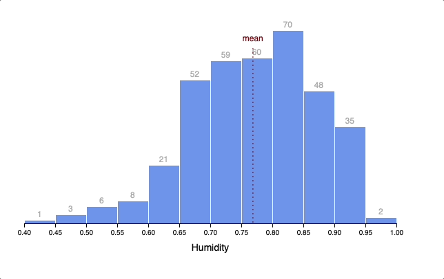
You can also build histogram charts and add in visual communication elements. I used lines to reflect the means for the dew point and humidity measurements that follow.
Animations and TransitionsD3 can manage existing data and know what pieces to take away from an existing set to bring in information from a new one.
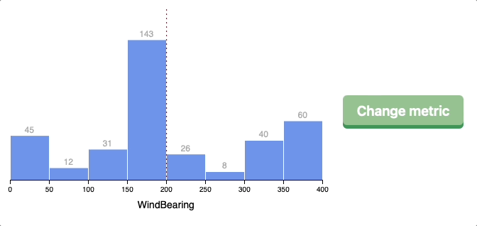
For example, here we are looking at wind speed. By changing the metric, the different bars fluctuate depending on the information you want the viewer to see. We easily transition from wind speed to dew point to humidity without leaving the page.
Similarly, you can animate the different added and removed bars as the chart progresses.
Using a line chart with D3, I drew a region that defines temperatures around a “freezing” baseline in Seattle.
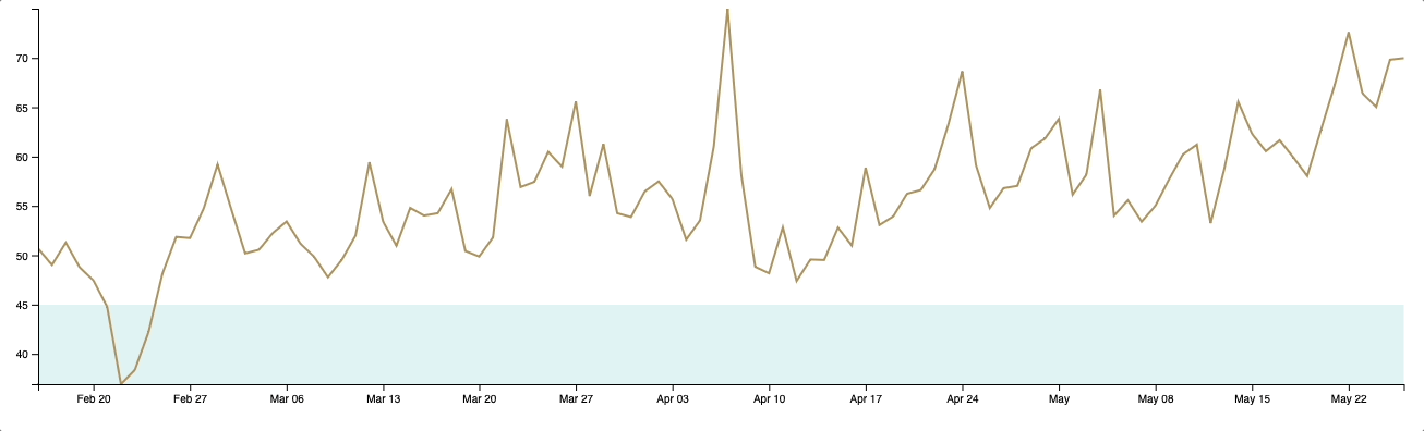
It didn’t often get below 32F in the dataset, so I used 45F as my freezing baseline.
Interactions in D3This example shows us hovering over different bars. It’s nice to be able to present various “Humidity” labels, and it is also helpful for the viewer.
There’s nothing fancy happening on the back end with this code. It’s just HTML, JavaScript, and CSS.
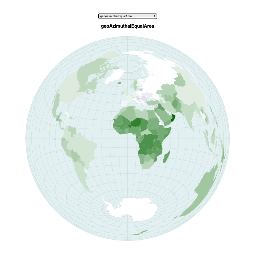
In the following case, the data came from World Bank population change metrics. My interest was in loading data from a comma-separated values (CSV) file. It worked well. Hover over a region to view that population change over time. For example, this reveals a high population growth in Africa, while the US growth remained relatively minimal.
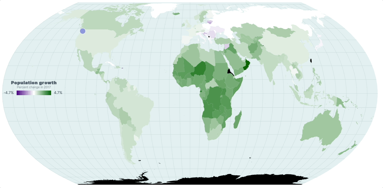
Defining the shape of countries on the map is all handled by D3. There is already a predefined dataset of that map, and you just pass it in.
Here I drew seasons on top of an existing dataset. You can imagine the code behind the scenes: I gave it start dates for the first day of spring every year, and then D3 can apply basic functions to determine if I was drawing a “Spring” or a “Summer” shape.
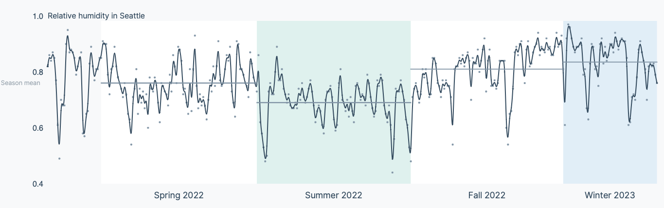
By doing this, I learned that it’s normal for spring and summer to have similar relative humidity in Seattle. I’d never considered this before, and that’s a great goal of data visualization - to reveal insights in the data to the viewer (and, in my case, the creator). This chart applies some smoothing to the line, but each data point is also a little dot. It can reveal every data point or just a general trend depending on what you want to present to the user.
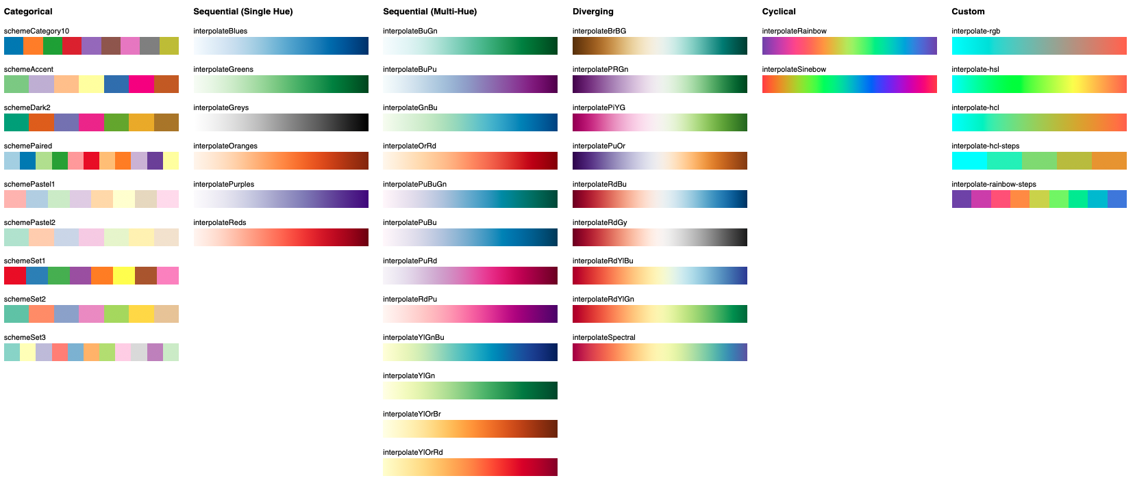
Here are some of the sample color schemes available in D3. If you want to represent different segments, it will generate these colors. The book also has a very cool section showing what that looks like to someone who is colorblind.
Common ChartsThis Radar Chart takes weather data from Seattle and gives a single day a specific weather shape.
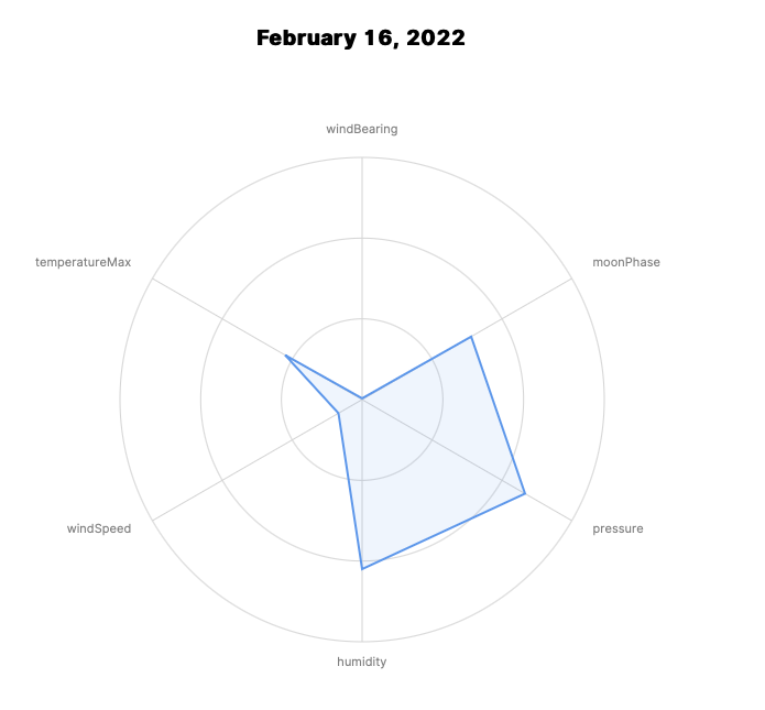
While I don’t know how weather shape would be useful, you might imagine someone charting a coffee, wine, or IPA flavor and giving that a radar profile. The representation would not only be intuitive but helpful to the viewer as a way to remember a coffee or beer other than by name.
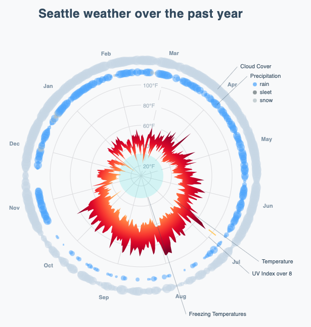
With some experimentation, we can use a radar chart to depict an interesting visual about the weather of Seattle over the past year:
The Pie Chart below slices-and-dices data by the different day counts per weather state.
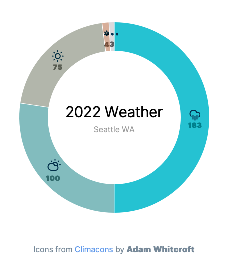
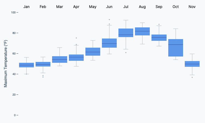
The same weather data in a Box Plot allows you to gather information like the maximum temperature in Seattle quickly.
Making a MapLastly, I want to share how you can work with maps and the different projections that come out of D3 natively. As you can see, a lot of projections are built-in. Based on your data and its polygons, D3 is asking how to skew that data and draw different countries. You get a sense of how these segments are skewed on the map just by how the other grid elements line up.
Where Else Can We Go?This is only the first expedition I’ve taken into D3. There is a vast amount of exciting territory still to be explored. So consider getting a copy of Fullstack D3 and Data Visualization and see where it might take you.
Can we help you apply these ideas on your project? Send us a message! You'll get to talk with our awesome delivery team on your very first call.
 Github
 LinkedIn